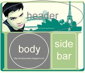
As you see in the picture above, a simple blog is basically made of 3 parts: the header, the body, and the sidebar. Navigation bars and footers are kind of optional. When you sign up for a site that offer blogging services like Blogger here, you are made to select preformatted templates of what your blog will look like. However nowadays, many bloggers opt to have a unique blog design that is truly their own. There are some who "borrow" layout from blog designers. A site for cool layouts can be found at Blogskins.com. There you can find layouts designed by blog skinners, free of use of course as long as you put a link back to the designer's homepage. Again, however if you would like to desgin your own blog layout and theme, you have to have at least significant knowledge about basic web design. To start out you need at least two simple tools to start from scratch. First, you need to know at least basic HTML FYI. HTML is the programming language used for coding web pages. Don't worry cause it's not really a difficult language to understand. Actually it's easier to understand compared to like XML, C++, Java, VB, etc. There are a lot of HTML resources in the web, from simple tutorials up to step-by-step how-to-do books for sale online. You can search just search so,me keywords o nYahoo! or Google and presto! You can access every site, anything about HTML. However, I highly recommend buying a reference book from your local bookstore so that you can study it every time you wish to. There's a an HTML guide at National bookstore which only costs PHP150! Very cheap. Secondly, if you want to a unique and a personal-themed site, you have to design your own graphics. Againm you have to know at least one software to generate your graphics. Personally, I'm using Adobe Photoshop CS and sometimes I incorporate Corel Draw. You may also learn other graphic software such as Paintshop Pro as long as you're comfortable using it. To start with I recommend, you may make a header, 750 to 850 pixels wide (Most users nowadays, use 1024x728 resolution so it would be prudent to make the entire width within this range) and 200-400 pixels high with some picture on the background and splashed across the scene is the title of your blog. Well, it's really depends on your style how you design your header.
Blog - short for web log.
HTML - stands for Hyper Text Mark-Up Language.
So now you have the basic two elements in blog design: HTML and a Graphic software. As you progress, you will discover that a site has to be nice to look at. The elements of a good color combination and neat-looking fonts come into scene. As a beginner, you tend to be very excited to use any color you wish and any fancy fonts (unless you use it for a header graphic) available. Always remember that simplicity is beauty. A blog that looks "unified" in terms of color harmony, graphics, and fonts used is a mark of a good blog. I have seen many blogs bombarded with vividly colored backgrounds, loud-colored graphics, and fonts so big - not to mention, annoying marquees and blinking texts - and they look so irritating to the eyes that you want to close it immediately. You don't want your visitors to leave your site immediately, do you? You may visit Webdeveloper's Notes and look for the link to color combinations. There you can find hundreds of 3-set color combos you can use for your site. For your fonts, I recommend using fonts of type Serif (Times, Arial, Verdana) or Cursive (Comic Sans MS) so that your blog will look nice to the eyes. Be consistent using same font size and color changing only if necessary.
Finally, I do hope you learned something from this simple tip. For your questions you may email me at andy_enero@yahoo.com. So have fun, personally, I have found web designing very rewarding though frustrating and confusing sometimes but it's worth it! Discover the creativity in you and stand out!
No comments:
Post a Comment